

Designing for a backlit trade show display isn’t the same as designing for a regular banner or booth wall. Backlighting brings your graphics to life — but only when the design, colors, and files are prepared properly. This guide will walk you through how to create artwork that looks incredible when lit from behind.
Whether you're using a SEGO modular lightbox, a Casonara backlit tower, or a branded counter from BriteBooth, these tips apply across the board.
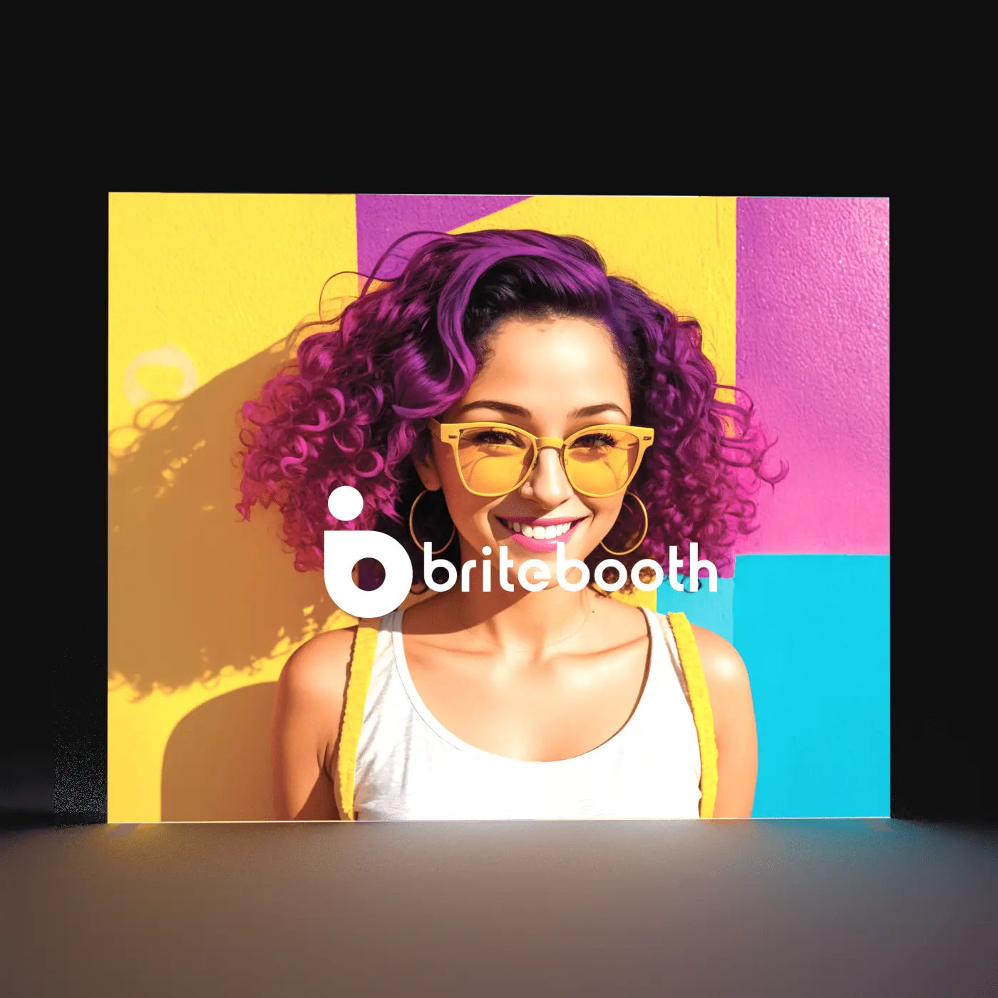
🎨 1. Use High Contrast Colors
Backlit graphics look best when bold, saturated colors contrast with light or white areas. Think strong brand colors on a clean background — like deep blue against white, or red on soft gray. Avoid muddy midtones, as they may appear washed out when backlit.
Pro Tip: When in doubt, keep your background light and use dark colors for text and logos.
🌈 2. Avoid Large Areas of Solid Black or Sometimes White
Backlighting isn’t ideal for large, dark color fields — especially black. LEDs tend to have a cool (bluish) tone, which can cause dark colors to appear bluish or uneven when lit. Instead of pure black, consider a rich navy or deep charcoal for a more consistent result if you have to have a dark background color. Large areas of white can also be an issue because certain display types, particularly the Wavelight may show the LED lights behind the graphic.
Related Resource: Glossary of Backlit Display Terms
📐 3. Design at Actual Size (or 50% at 300 DPI)
Your artwork should be created at full scale (1:1) at 150 DPI, or half scale (1:2) at 300 DPI. SEG fabric prints are large format, so vector logos and high-res images are a must to avoid pixelation.
- ✔️ 120 DPI at full size (preferred)
- ✔️ CMYK color mode
Need help? Our design team offers flat-rate design services for backlit graphics.
🧪 4. Consider How It Will Look Lit
Remember: your final display will be lit from behind. This means subtle gradients, fine lines, or soft shadow effects may get lost in the glow. We recommend bold fonts, high-res photos, and minimal texture.
Test Tip: Preview your design on a bright monitor with your room lights off to simulate how it might appear when illuminated.
🧵 5. Leave Space for the SEG Edge
Backlit graphics use SEG (silicone edge graphics), which tuck into a frame channel. Keep important text and logos at least 1.5" from the edge to avoid being hidden in the groove or distorted by fabric tension.
See the tech: Learn more about how SEG graphics work.
📁 6. Submit the Right File Type
We accept print-ready PDF, AI, or TIFF files. If submitting PSD or INDD, be sure to convert fonts to outlines and embed images.
File Checklist:
- ✅ Artwork template used
- ✅ Text converted to outlines
- ✅ Linked images embedded
📦 Final Thoughts: Design for the Environment
Always consider where your booth will be set up. Dim expo halls? Go with brighter backgrounds and bold callouts. Natural light venue? Make sure your imagery stands out without relying solely on lighting.
And remember, less is more. One clear message is more powerful than five logos and ten bullet points.
🎯 Need Help Designing Your Backlit Display?
Contact our team or browse our full line of lightbox displays to get started. We offer complimentary 3D proofs and expert design help for every order.
Share:
Why Backlit Trade Show Displays Outperform Traditional Booth Setups
Why Are Trade Show Lightboxes Taking Over? The Bright Future of Exhibiting